Profiles Redesign
Modernizing a decade-old core product to align with how marketers actually troubleshoot — and making the business case to do it right.
I led the end-to-end redesign of Klaviyo's most legacy product area — influencing a pivot from a 1:1 code migration to a full experience overhaul that cut time-on-task by 30% and support tickets by 23%.
How might we modernize a decade-old product without disrupting 150K+ existing users — while making it dramatically easier to troubleshoot customer data?
Imagine a product area that hadn't evolved since 2012
In 2022, engineering kicked off a strict 1:1 migration of Klaviyo's oldest frontend code from Backbone.js to React — rebuild what exists, exactly as it exists. But Profiles, the repository for every piece of customer data Klaviyo holds, hadn't meaningfully changed in a decade: broken navigation, deprecated patterns, and workflows that no longer matched how marketers worked.
A straight 1:1 rebuild would have locked in over a decade of accumulated debt for years to come. I saw a narrow window to make the case for doing it right.
Two pages, a decade of debt
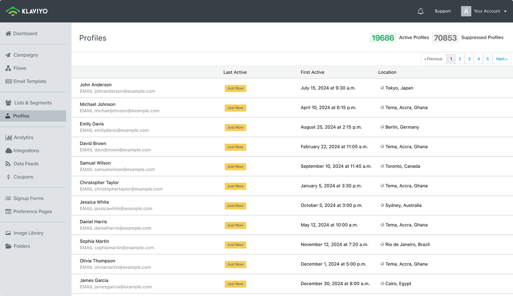
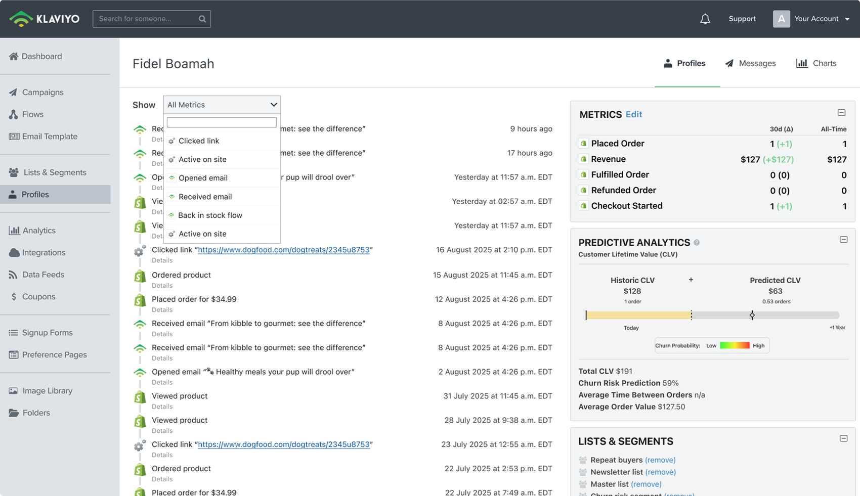
The legacy experience failed marketers at both ends of their workflow — finding a record, and understanding it once they got there:
Billing confusion
Counts didn't say whether they meant email or SMS profiles — the #1 ticket source in this area.
No real search
Finding a single record took 7 clicks through nested menus.
Buried data
Roughly 50% of troubleshooting data sat below the fold.
Hidden consent
The single most-checked status required excessive scrolling to reach.
I led a 3-week vision sprint, developing data-driven ideas aligned with marketers' goals
Rather than react to an engineering constraint, I reframed the migration as an opportunity — running a focused sprint to define who uses Profiles, why they use it, and what friction was costing us.
01 The Troubleshooter
The core archetype: someone entering a profile to resolve an issue, verify data, or confirm a record's status. Speed and clarity beat breadth of features.
02 Search first
Finding a record should take seconds, not clicks. Key profile data should never hide behind nested menus.
03 Glanceable status
Consent, contact, and subscription status up front — a clear picture of the customer relationship the moment a profile loads.
From code migration to redesign
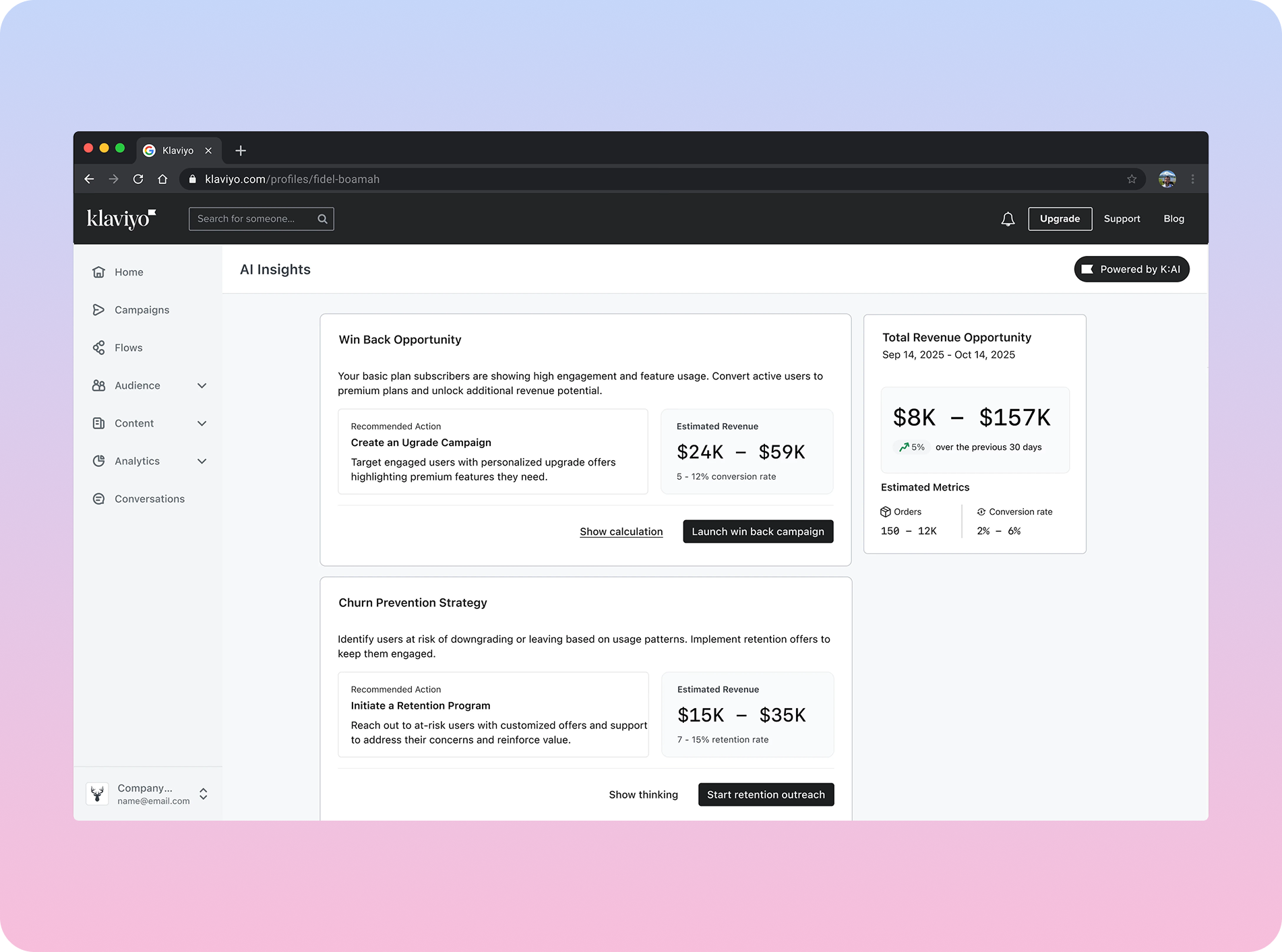
Rather than accept the engineering constraint, I partnered with business analysts to translate design friction into hard numbers leadership could act on — calculating the operational drag created by the existing Profiles experience.
Leadership approved the expanded scope. What started as a code migration became the most significant investment in Profiles in over a decade.
Three decisions aligned the product with how marketers troubleshoot
Information architecture before layouts
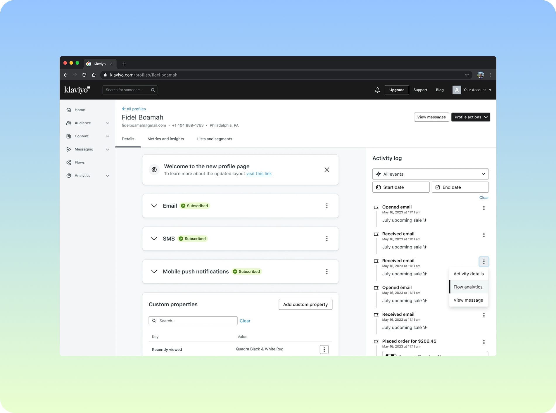
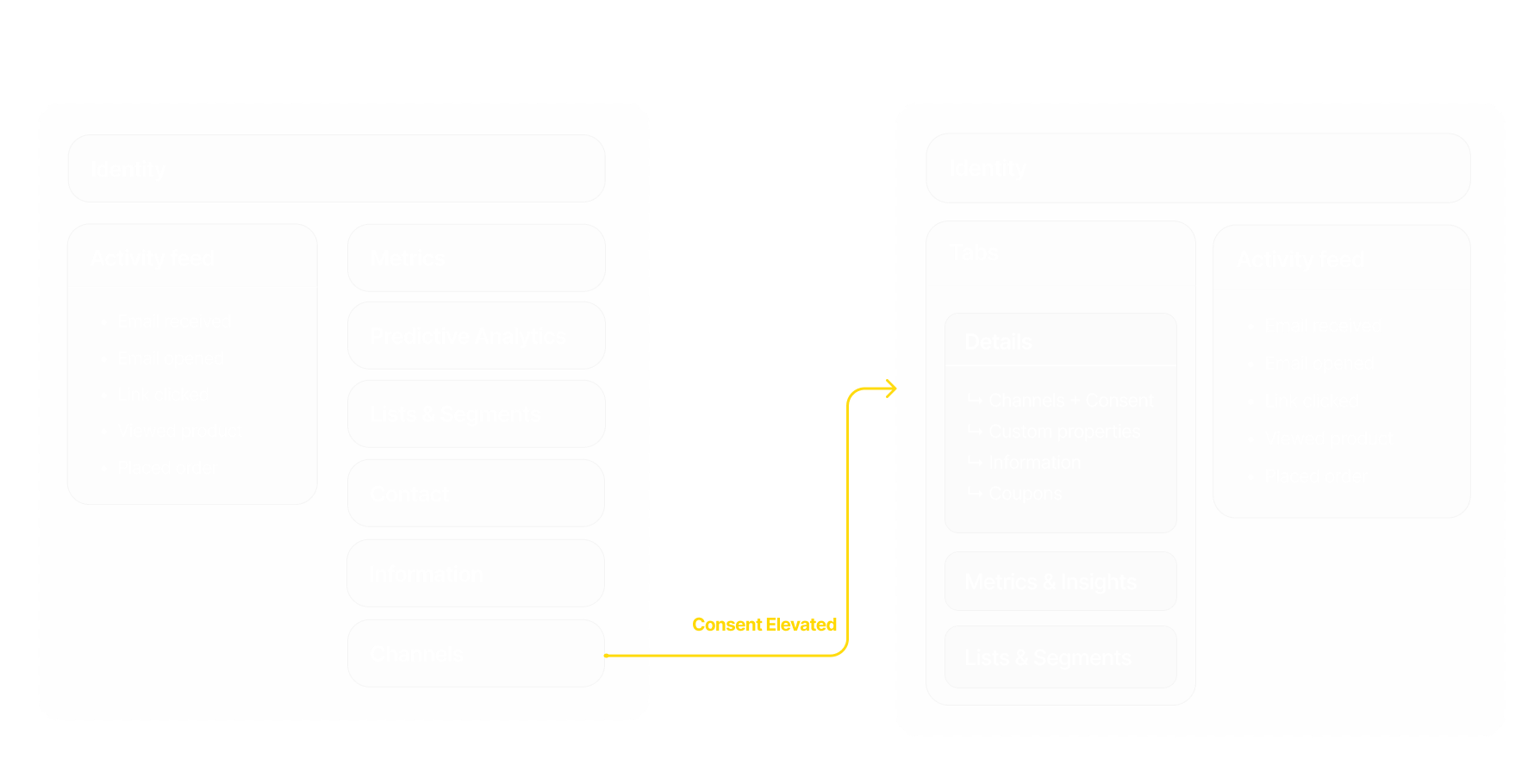
We locked the IA before designing a single screen — elevating consent status in the hierarchy so the most-checked data point is immediately visible to anyone troubleshooting a profile.
Search first, everywhere
Search and column filtering in the profiles table cut the steps to find a record from 7 clicks to 3 — marketers filter by any property without leaving the page.
Clarity where money is involved
Profile counts drove billing confusion — the #1 ticket source in the area. A clear card layout with contextual tooltips explains exactly what each count represents.
Troubleshooting in one place
The payoff: marketers verify a customer's consent status and history without ever leaving the profile page — a multi-tab workflow collapsed into a single, focused panel.
Aligning the experience with marketers' mental models
Reflection: The redesign shipped to 150K+ users and paid for itself within the projected six-month window, with its components adopted into the Klaviyo design system. It taught me that modernizing a decade-old product is as much about preserving muscle memory as improving it — and that the fastest way to change a project's scope is to speak in the numbers leadership already cares about.